Learn How to Create a Doughnut Chart in Excel With Dynamic Colors
The Doughnut charts can be a very useful tool when showing progress or percentage values.
Making them dynamically color, based on their values will definitely increase their impact and will provide better overview of the data shown.
In the following video you can follow the process of creating such chart.
A link to download a chart template for free is available below.
We're happy to provide the file used in the video above for free. To see the download link, just fill the subscription form below. This way you'll also be up to date with all our updates!
If you found this video useful, make sure to like it, share it and subscribe to our YouTube Channel, where you'll be able to find more free video tutorials.
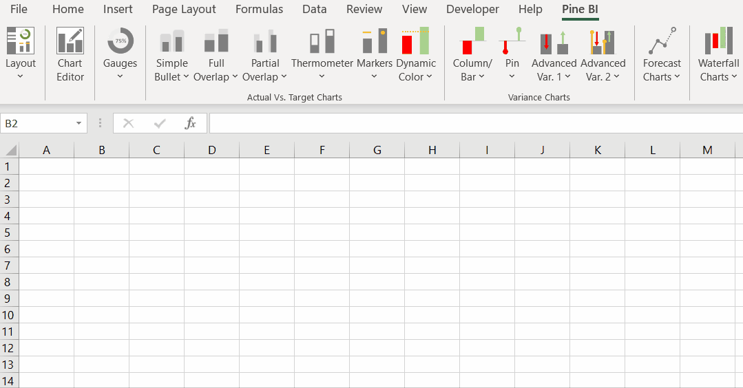
Also, make sure to check out our Excel add-in Pine BI, which allows users to create advanced charts in seconds and help create dynamic Dashboards.
You can also review our Premium Templates, which are already set up and ready to use - all you need to do is just add your data!
More Chart Tutorials
Dashboard Tutorials

Check out our Premium Templates


